
Trends are well-known changes that happen in all creative fields, and web design is no different. Born of experimentation and innovation, trends are the driving factors for change, which push an industry forward for the better.
The web is an unique environment that is constantly changing and evolving, and with that in mind, we run down on what we believe are the most important trends to be looking out for.


More brands adopt a mobile-first approach
As the name suggests, the mobile-first design is the process of designing for mobile first, then working up to the bigger ones.
The mobile-first approach to design isn’t new to 2017 and has been around for a few years now, but with mobile phones now officially named as the primary devices used for browsing the web, more companies are realising the importance of having a site that effectively delivers content on a smaller screen, and is rushing to get onboard.
Content is designed to fit on mobile and smaller screened devices first, then you work up towards the larger-screened devices.
Design and visuals aside, the mobile-first model and the restrictions it brings is a useful way for brands to really consider what their core content and message that they want to communicate.
Smartphones come with significantly smaller screens than tablets and desktops, which limit the amount of content a user can easily view at once.
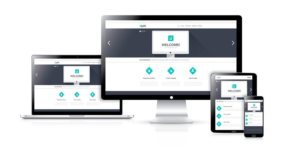

Wider implementation of responsive design
Although responsive design is also something which has been around for a few years, what we predict to see over the coming year is an even bigger uptake in the number of brands, both big and small, who are building responsive-based sites.
Responsive design is essentially an approach to building a site using CSS media queries and flexible grids/layouts to create a single, dynamic site which adjusts and re-jigs it’s content to best display itself on various sized devices. It works hand-in-hand with mobile first, as mobile first designs the experience and the look, and responsive implements it.
One of the bonuses of responsive design is that it allows businesses to pay for just a single site build which effectively delivers content on mobile and tablet, all the way to laptops to big-screened desktops.
Cost-effectiveness aside, the reason we anticipate even more brand’s employing this is because of an update to Google’s ranking algorithm which dropped in April last year. To sum it up, Google’s update now boosts the rankings of sites which optimises it’s content to mobile devices and users. Any site which isn’t optimised for mobile is set to see a major shake-up in where it ranks online.
It’s an all-encompassing toolkit of pre-built HTML, CSS, and JavaScript patterns which will help get you and your developers on the right path to a mobile-friendly site in no time.
Credit: Contents extracted from Zazzle Media by Jamie Leeson
At Krome, we specialise in website design and development services. If you or your client are interested in creating a site, it’s time to tell us about your project or have a chat about what we can do. You can contact us here.