Responsive Design Process
Our responsive design process is fluid and changing, just like the technology we build with. The flowchart below outlines the general process we use today to develop responsive sites. This process stems from our team make-up, our tools, and our work flow.

Research
Talk with client and gather expectations about the projects.

Define
Determine site goals, evaluate technical requirements, perform content audit.

Establish Content Priority
Establish content priority for the designer using real content via a:
Priority Guide
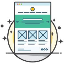
For complex sites with many unique templates, create static, mobile-width priority guides, similar to wireframes.
– or –
Content Priority Prototype
For simpler sites, create a responsive, HTML-based priority prototype.

Establish Style
Create an HTML-based style prototype that establishes a visual guide for the site.
A Typical Style Prototype Can Include:
- Typography
- Colours Swatches
- Button Styles/States
- Header
- Navigation
- Photography

Finalize Design
Create design assets in HTML and CSS based on needs and style outlines in previous steps. This step is often a cyclical collaboration between designer and developer.

Code Responsive Templates
Code responsive templates starting with mobile first. Use the priority guide or prototype as a roadmap for how to prioritize mobile content. Incorporate design assets and establish how the design should responds as browser width increases.

CMS Integration
Integrate templates into the content management system of choice.

Launch
Release the responsive creation to the world!
At Krome, we specialise in website design and development services. If you or your client are interested in creating a site, it’s time to tell us about your project or have a chat about what we can do. You can contact us here.