Know what kind of fonts you’ll be using
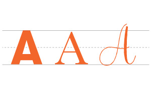
Various fonts have different widths and styles. You can’t kern until you know what font you’re using.
Fix leading and tracking before kerning
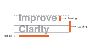
Tracking – Uniform space between all letters
Leading – Vertical space between lines
Kerning – Space between individual letters
It is always practical to work on the leading or tracking first before kerning.
Kern each letter individually
Human eye is no doubt a better judge than the computer’s auto kerning settings. Adjust the spaces one by one if you have to. That extra effort will pay off when producing a premium quality design.
All about Visual Space
Do remember that people are not going to measure each space to check if it is equal. People visualize it and see if it’s easily readable.
Spatial relationships for slanted letters
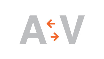
Each individual letters takes up different space. (A, V, Y, W) Lessen the negative space when next to those slanted letters.
Kern in groups of three
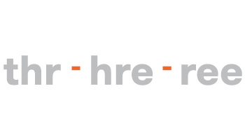
If you look at a word as one whole, it’s easy to miss details. Take letters in groups of three and kern three at a time.
Don’t neglect the spacing between words
Letter spacing is important, but so is word spacing. Make sure there’s enough space between words to easily distinguish one from another.
Less is always more
Don’t over-kern.
Overly tight letters can become unsightly and illegible to read.
Review the typeface from different perspective
This hack helps your familiarity with words and will help in the future as you will remember it subconsciously.
Prepare at least two versions of the design
Design in different versions so that you will have a general idea of how it looks like in different sizes and ensure that it is readable.
At Krome, we specialise in website design and development services. If you or your client are interested in creating a site, it’s time to tell us about your project or have a chat about what we can do. You can contact us here.


