Here are the Visual Hierarchy in Web Design
Primary Focus
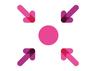
Our eyes should be drawn to a particular point at first glance to provide good reading experience for the user.
Movement

A page layout is mainly designed in legible grid format of vertical and horizontal lines. Be sure your audience is moving towards the right direction.
Balance
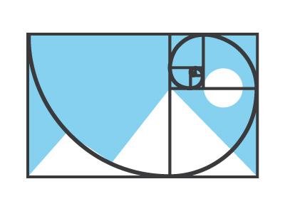
Website with well-balanced design will make customers fall in love.
Repetition
Be sure no one misses the callout ever again!
White Space
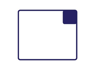
Creating the right amount of whitespace on the page, makes the design easier for people to roam around and find the small, densely packed boxes of content.
Patterns
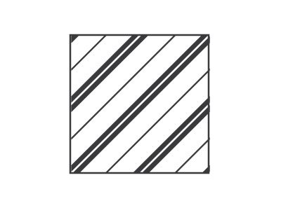
Adding in some texture smartly will minimise the negative space. The overall arrangement of space, content and other design elements will make a holistic sense.
Minimal Approach

Limited data always work best, but be sure no one misses the main point.
Types

Words are important, but their style is equally essential. Use the right font for the right purpose.
Size Matters

Reader will always read the bigger things first. Using the right font size will attract your readers.
Random
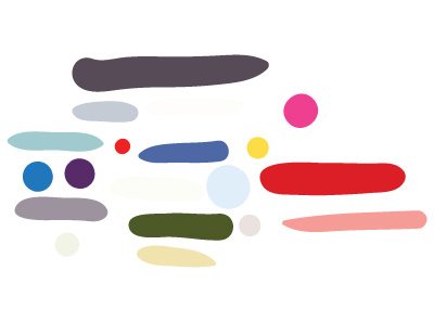
Don’t be afraid to break the rules. Sometimes, the lack of symmetry can make a great impact!
Clutter Control
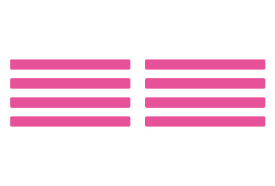
Alignment work the best to make anything appear clutter-free.
Contrast

Light vs Dark, helps create emphasis. Use contrast wisely as it can make or break your website design.
Colour & Tint
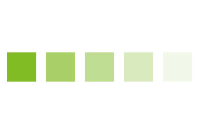
Colour is an interesting tool as it can function as both an organisational tool as well as a personality tool. It can affect everything from a websites brand to symbolism. Use colours wisely to accentuate important information.
At Krome, we specialise in website design and development services. If you or your client are interested in creating a site, it’s time to tell us about your project or have a chat about what we can do. You can contact us here.