

Here are 5 questions you should be asking yourself in designing a successful user interface for website, that we can look into.


Life has never been more visual than it is today. With web access moving from your desktop to the palm of your hands, the amount of control that creators have over their material is unprecedented. Seamless web design has taken center stage on most digital platforms, and creating a space that appeals to users is a necessary part of the process.
With the amount of content available today, consumers have a low tolerance for navigating pages that are not user friendly. More intuitive and visually appealing pages are just a Google search and click away, so providing users with good reasons to stay on your page is crucial.

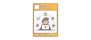
1. Who are your users?
At the heart of all good web interface design is a thorough and deep understanding of its audience. The way in which an illustrator will perceive a page differs from that of a data analyst. Taking time to understand the thought and work process of your users will pay off in the long run, especially when navigating your interface turns out to be intuitive to your audience. If the learning curve to understand the functionalities of your page is slow, it will cost you. Users tend to check out and opt for other options if they feel like your interface has not been put together in a logical way. And that logic itself is highly subjective – depending on the industry and experience level of your users.
We cannot stress this enough – test your prototypes! User inputs are part of the process. Test your prototypes with users, take their comments seriously, work them into future iterations and test the refined prototypes again.
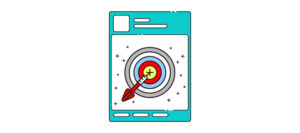
2. Where do you want your users’ attention to be?
As a creator, there is power in the ability to draw your users’ attention and create focal points. The integration of data analytics has allowed business owners to push relevant and customized recommendations based on the browsing history of its users. Aside from being a targeted marketing tool, this in itself can create the perception that you understand your users, and are flagging out the things that you know will be important to them.
The art of visual hierarchy, using different font sizes, typography, and white space will help you to achieve the effect you want. Playing around with colour and contrast can also position your content in visually beautiful ways. Cognitive psychology studies have shown that the longer you can hold the attention of your audience, the more time they will spend processing the material and content. From time to time, introducing surprise elements that deviate from the norm will also draw attention to your message. After all, who hasn’t noticed themed Google search engine designs?
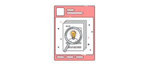
3. What are some good references for web design?
Doing your ground research will give you some idea of what has worked for other web designs. At the forefront, we have award-winning sites like NationalGeographic.com that nabbed the Best User Interface at the Webby Awards 2017. Crucial to its success is the use of high definition photos to frame the content and articles, with most of the pictures taking up the entire frame as you scroll seamlessly through the page. Translating NatGeo’s unique selling point from print to screen requires zero compromise on the quality and uniqueness of the photos – an important part of its branding and design concept.
Voted in the same category, Intercept.com presents an array of bold typography and colour in its interface design. The site couples short summaries of articles with equal emphasis on the pictures that they are meant to caption. This creates clean, bite-size information that can be consumed quickly as you move through the page. Endless scroll is also featured here, as with NatGeo, without the congestion of multiple tabs.
Looking through the interface designs of other sites, especially those that are directly related to your industry, can act as a quick pulse check on the design elements that users prefer or have grown accustomed to.
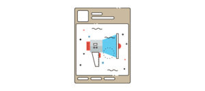
4. Do you have the tools you need to create an experience?
Well, now that you know your audience and done your research, technology is readily available for you to jumpstart the creation of your masterpiece. Investing in UI/UX tools such as Balsamiq and Justinmind allows you to build prototypes quickly by focusing on wireframing and a drag-and-drop method of constructing UI elements.
Incorporating UI/UX analytics to track user feedback on your prototypes can provide you with some real insights that will develop your product. Mixpanel is a tool that tracks the individual user’s journey through a product so that you can analyze important elements such as level of engagement and retention. Mapping your user’s pathways helps you to categorize or reposition certain elements of your interface for targeted exposure.
5. What are some design traps that should be avoided?
If you can only have one takeaway from this article, we hope that you remember this – don’t overcomplicate your web interface design. Throwing in a multitude of elements and bombarding your users with information is a no-no. There is such a thing as too much colour, incompatible font and the poor positioning of content or links. When in doubt, keep it simple! You will find plenty of forums on Reddit that can point you towards poorly designed interfaces – but here are some samples. You have been warned.
At Krome, we specialise in website design and development services. If you or your client are interested in creating a site, it’s time to tell us about your project or have a chat about what we can do. You can contact us here.