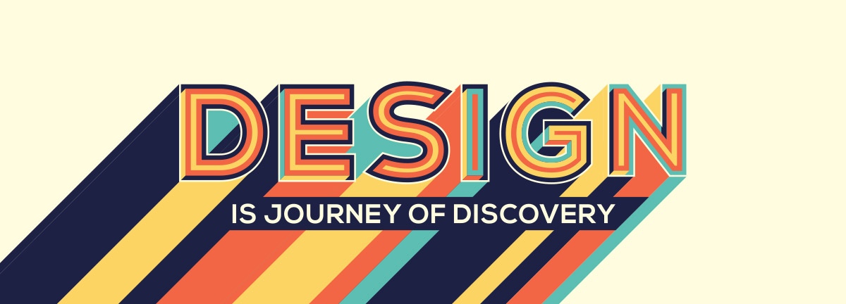
Simply put, typography is the art of curating type.

While simple in definition, there is much more than meets the eye when it comes to the execution of effective typography and how it relates to web design. Particularly with the onset of minimalism, typography has taken centre stage in most web designs.
Manipulating and working with typography is the bread and butter underlying the work of web designers. More than just putting together a readable set of words, every web designer must understand the fundamentals of typography and how his or her choices impact the viewer’s perception. The combination of your choices and the way in which they all come together can define, instantaneously, the impression of a good design.
Craft An Emotional Response
When the design of type is your main focal point, there is room to manipulate and curate the emotions of your viewers, and perhaps event their physical responses. With the same content and vocabulary, playing around with the typography can in face result in varied emotive effects.
Designers often use typography to convey the intent of the communication (e.g. a call to action, an advert, a serious and grave matter etc.). In designing your webpage, consider how you would like your consumers to feel about your messages. Riding on the subconscious emotive effect of typography can contribute significantly to your user experience.
Get The User’s Attention – And Keep It
Good typography allows the reader to consume the formatting subconsciously, but have the reader’s attention focused on the content instead. When the typography is badly executed, this becomes a distraction to your users who are then disengaged with the message that you are trying to put across. This distraction increases the chances of your users skimming through your content on the surface and losing interest quickly along the way.
Good typography serves its purpose without the users’ realisation, working subtly in the background so that you will have your users’ attention exactly where you want it.
Help your users organise information
Manipulating typography can greatly contribute to the visual hierarchy of your site. Use typography to guide your reader, tell them what’s most important in the text, and help them to organise information. For example, bolded headings can indicate a change in the segments, and lets your reader know that you’re changing topics. This differentiation can also be achieved in other ways of controlling the typography, including adjusting the size and spacing of the font.
On your site, segmenting your content into chunks of information using typography will increase the readability of your page. Essentially, doing so is to use the design to place your content into a neat template that can help to improve the retention and recall of key information on your site.
Creating the look of a professional finish
Depending on the context in which your message will be displayed, your users are probably accustomed to certain typographies that are generally used for that defined purpose. For example, the script font type, known for its elegance, is often seen on wedding invitations, diplomas or certificates. On the other hand the display font type is used regularly on movie posters, newspapers and banners simply because it has been designed to grab your attention or to give emphasis to a certain areas. With the rendered characteristics of hand lettering as another example, designers often use this font to add a human dimension element to the design.
Knowing your target audience and understanding the kind of visual content that they often come into contact to will guide your design principles in typography. Aligning the style (without necessarily having to match it perfectly) can give your site the professional look that it needs.
The research says it all
There has been extensive research into typography and how it affects the user’s perception of the content. In on such study by Errol Morris, 40,000 readers were presented with the same passage, but in six different typefaces. When asked whether the readers agreed or disagreed with the content of the passage, readers who were given the passage in Baskerville were much more likely to agree with it, especially when compared to Comic Sans and Helvetica.
One of many studies, this experiment points to the underlying psychological mechanisms that can then influence consumer behaviour and decisions, just from the typography alone. Indeed, in the visual world, typography sits on the top of the food chain, impacting many aspects of the user experience along the way. In web design, the impact is no less important.
At Krome, we specialise in website design and development services. If you or your client are interested in creating a site, it’s time to tell us about your project or have a chat about what we can do. You can contact us here.